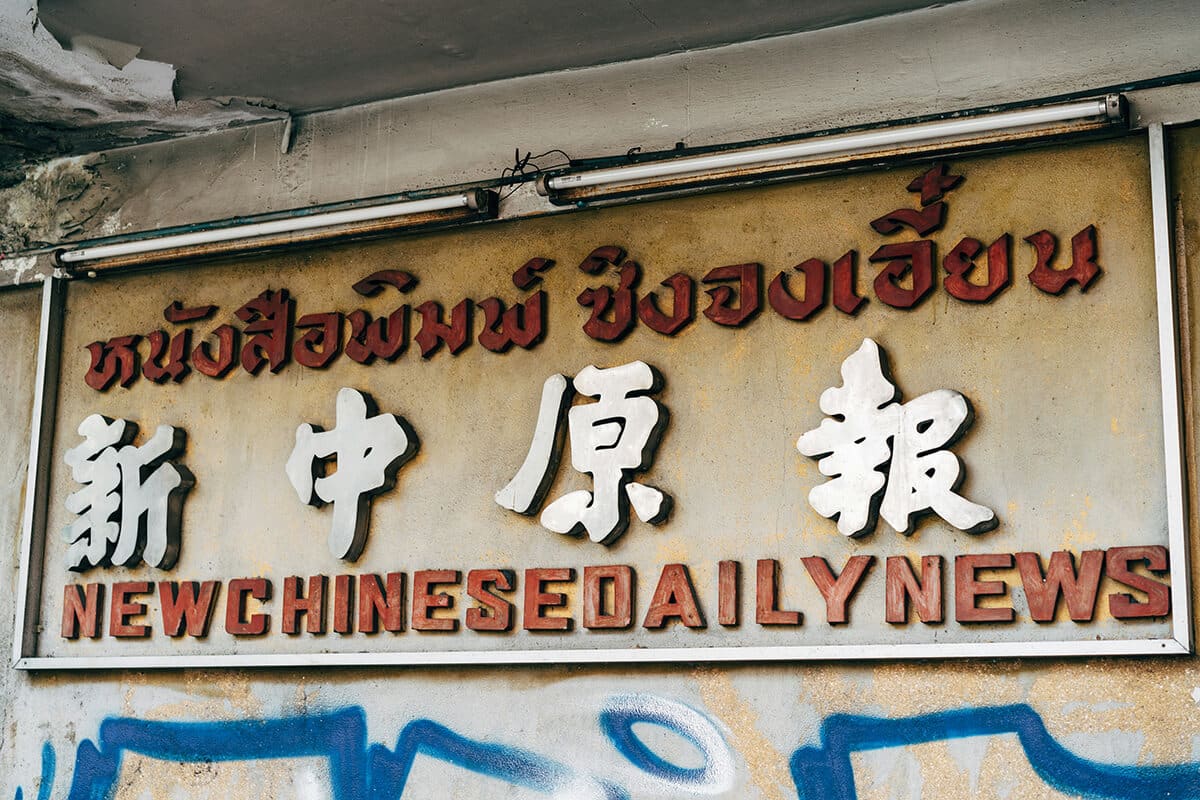
When designing websites for Thai-speaking audiences, typography plays a pivotal role in delivering a seamless, culturally resonant, and readable experience. Thai is a tonal and complex script with unique typographic characteristics that require careful selection of fonts, pairings, and spacing strategies. As Thailand’s digital economy grows, the demand for locally tailored web experiences is rising, making Thai font integration a critical skill for any web designer targeting this market.
Whether you’re designing a government portal, e-commerce website, educational platform, or lifestyle blog, understanding the nuances of Thai typography helps establish trust and authority with your users – two key principles of Google’s EEAT (Experience, Expertise, Authoritativeness, and Trustworthiness) framework.

Selecting Thai fonts isn’t just about aesthetics – it’s about legibility, tone, and technical compatibility.
1. Understanding Thai Script Characteristics
Thai script lacks spacing between words and includes diacritics above and below the main line of text. This makes line height, letterform clarity, and overall spacing even more critical compared to Latin scripts.
2. Top Recommended Thai Web Fonts
Below are some well-designed and widely-used Thai fonts:
| Font Name | Style | Use Case |
|---|---|---|
| Sarabun | Sans-serif | Professional, academic websites |
| Kanit | Rounded sans-serif | Tech, startup, and lifestyle sites |
| Sukhumvit Set | Modern sans-serif | High-end branding, UI interfaces |
| Taviraj | Serif | Editorial, blog, government |
| Mitr | Friendly sans-serif | Youth-focused, informal content |
3. Font Licensing and Hosting
Most Thai fonts from Google are free and optimized for web. However, for unique branding, paid Thai font licenses from Cadson Demak, TypeK or Font PSL can elevate design distinctiveness.

Font Pairing Best Practices
Pairing Thai fonts with Latin fonts is a design challenge that requires balance. Here’s how to do it right.
1. Aligning Typeface Tone
If you use Montserrat for Latin text, Kanit is an excellent Thai complement – both are geometric sans-serifs. For serif pairings like Merriweather, consider Taviraj, which maintains a traditional, literary tone.
Tip: Maintain visual harmony in x-height, stroke contrast, and letter spacing between the Latin and Thai fonts.
2. Adjusting Line Height and Spacing
Thai characters often need more vertical space due to tonal marks. Use line-height: 1.8; or more for body text to ensure readability.
body {
  font-family: 'Kanit', sans-serif;
  line-height: 1.8;
  font-size: 1rem;
}
Avoid tight line-heights that clip diacritical marks, especially in mobile layouts.
3. Responsive Typography
Use fluid typography with clamp() for better scaling:
h1 {
  font-size: clamp(2rem, 4vw, 3.5rem);
}
This ensures Thai headers and Latin ones scale together proportionally.

Real-World Examples of Thai Typography Done Right
- Thai PBS: This public broadcaster uses Sarabun for clear, journalistic tone, paired with clean layout spacing and accessible text hierarchy – excellent for readability on both desktop and mobile.
- LINE Thailand: LINE’s microsites often use Kanit or Mitr for playful, modern tones, reflecting its youthful target audience. Typography here reinforces brand personality.
- SCB Easy App: The app and site use a customized version of Sukhumvit Set, blending trustworthiness with clarity in digital banking. Carefully adjusted font weights make it accessible even at small sizes.

Actionable Tips for Thai Typography Integration
✅ Always test on real Thai content. Dummy text like “ไทยๆๆๆ” doesn’t reflect true sentence structure and diacritic positioning.
✅ Avoid using display fonts for body text. Fonts like Anakotmai are decorative – reserve them for headers only.
✅ Use native font fallbacks. For performance and graceful degradation, use a font stack:
font-family: 'Sarabun', Tahoma, sans-serif;✅ Mind the cultural tone. Serif fonts may suggest authority (ideal for government, education), while round sans-serifs feel friendly and casual (perfect for startups and lifestyle brands).
✅ Check cross-browser rendering. Some Thai fonts may appear differently in Safari vs. Chrome. Test extensively.

Expert Insight: Designing with Cultural Sensitivity
“Thai typography isn’t just about font choice. It’s about respecting the language’s rhythm and script culture,” says Anuthin Wongsunkakon, co-founder of Cadson Demak.
He suggests involving native Thai designers or proofreaders in UX/UI projects that heavily rely on textual content.
Final Thoughts
Integrating Thai fonts and typography into web design is more than a localization step – it’s a strategic design move that enhances UX, brand trust, and cultural engagement. By choosing the right fonts, pairing them thoughtfully, and designing with Thai script intricacies in mind, you elevate your design’s quality and authority.
Remember: great typography in Thai isn’t just about looking good – it’s about communicating effectively with your audience.
Image sources & tanks to:
- Photo by Markus Winkler on Unsplash
- Photo by CHUTTERSNAP on Unsplash
- Photo by Markus Spiske on Unsplash
- Photo by camilo jimenez on Unsplash


